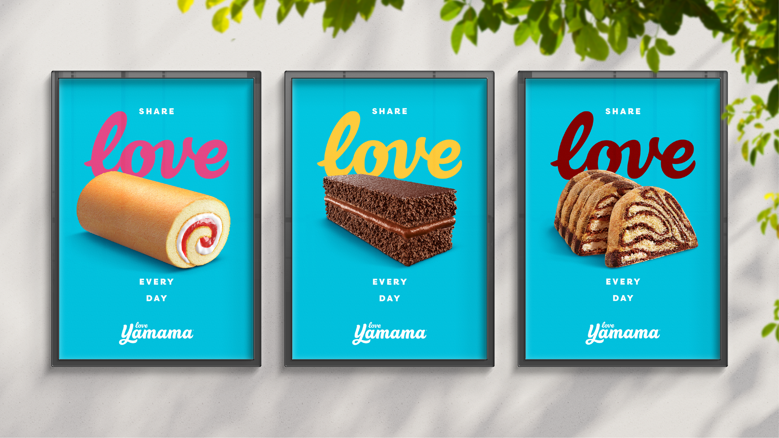

Share love, every day
Challenge
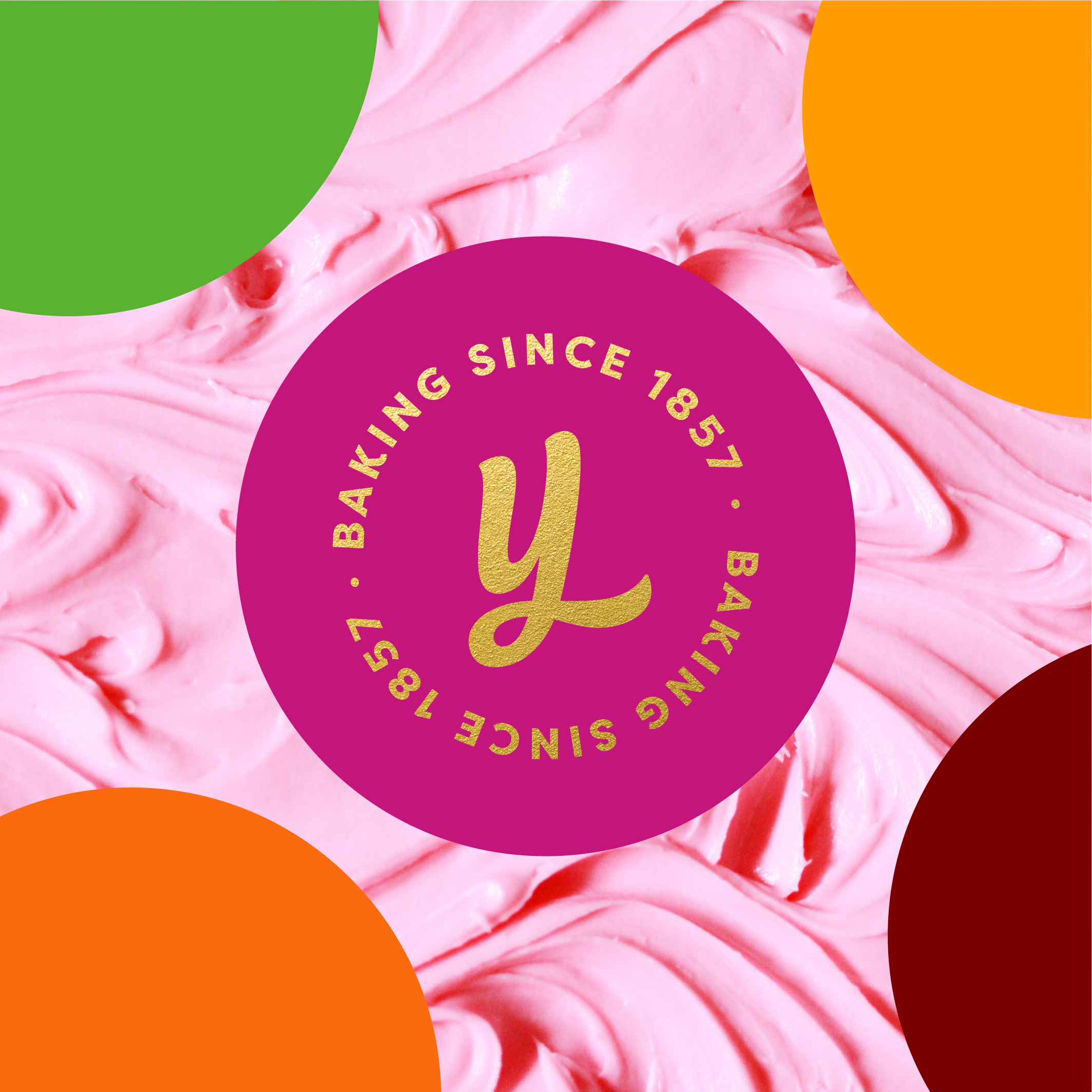
Since the 1980’s, Yamama has established itself as a true family favourite, leveraging Gandour’s 150 years of expertise in confectionary to create a reputation across the Middle East for providing great quality cakes at affordable prices.
In recent times however, competition at shelf has grown ever more fierce – with numerous new entries from local and global players alike.
Whilst Yamama has managed to keep pace through a combination of value, nostalgia and long-standing salience, they have lacked the toolkit to vie for the hearts of a new generation.
How do you evolve a brand to look the way it has always felt?
Solution
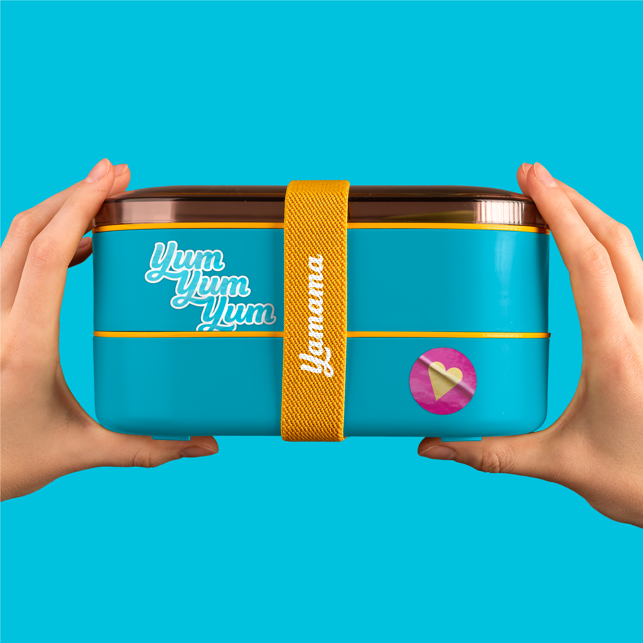
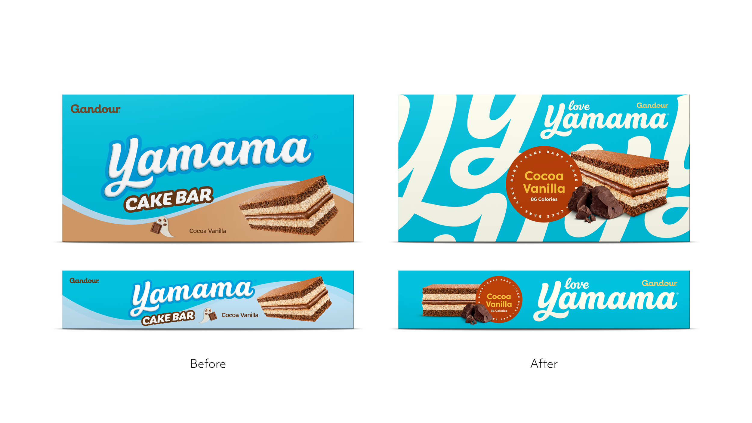
The core of Yamama has always been about connection – particularly that between parent and child – cakes that are shared to bring a little joy to the ones you love most.
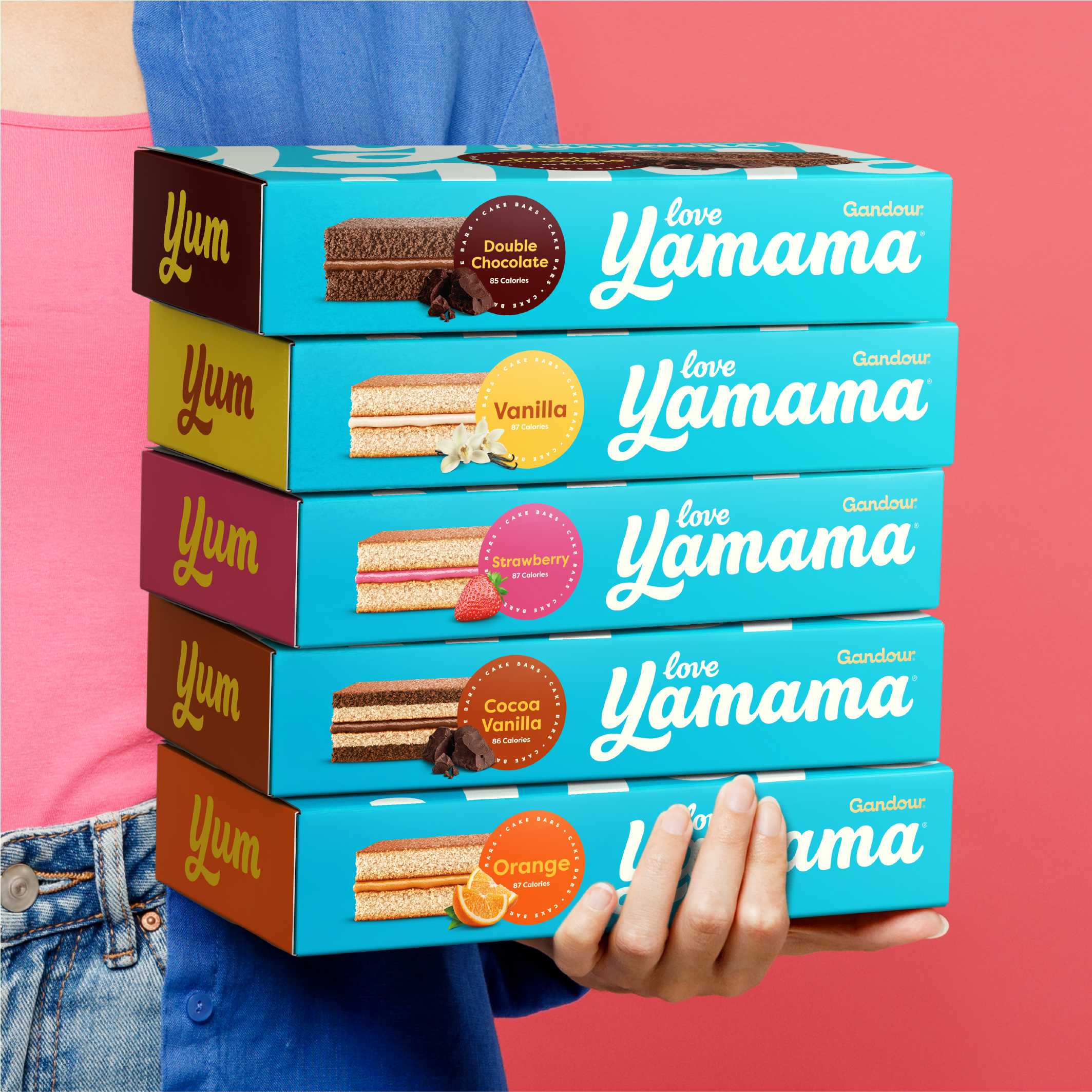
We used this foundational idea as the jumping off point for visual storytelling, from a smooth and creamy infinite pattern utilising our ‘Y’, to the literal addition of the word ‘love’ to our refined and modernised logotype.
The new style is expressed with colourful energy and generous abundance – building layers of excitement on top of the refreshed blue background.
Together, we realise a world filled with delicious vibes and a sense of youthful exuberance, fit to compete for the parents of tomorrow.
Partners
Client
Gandour
Strategy
Silas Amos
Typography
Rob Clarke
Production
The London Artworking Co.